Extra Space Storage
We set out to redesign the mobile experience of finding, evaluating, and reserving a storage unit, to help out ExtraSpace’s conversions. We managed to raise it by 23%, which was a big deal in a highly-competitive market.
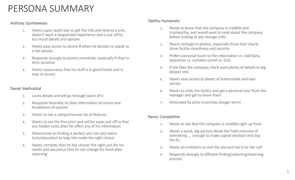
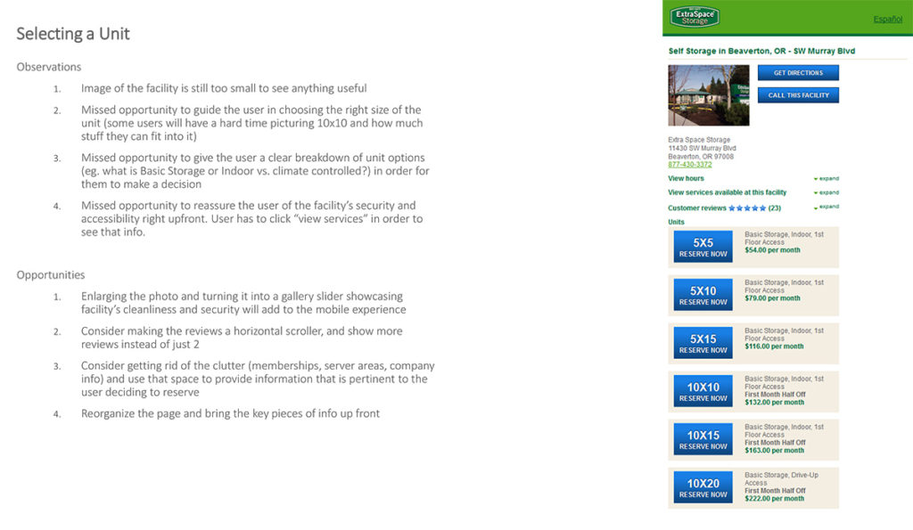
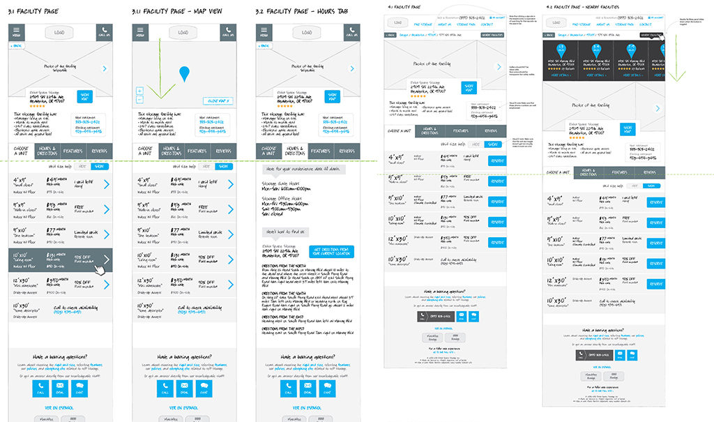
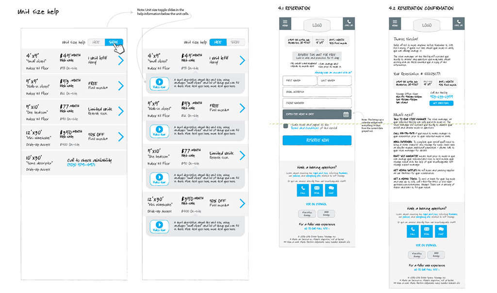
Project Summary: We begun by evaluating the existing experience to uncover any obvious usability problems and missed opportunities as well as evaluating competitor’s sites to see common trends and pitfalls. We then gathered a bunch of qualitative info from the customer service team and synthesized it into 4 personas with core adjectives: spontaneous, humanistic, methodical, competitive. Each of the adjectives gave an insight into certain flow and interaction ideas. One of the notable ones was the fact that most people had trouble visualizing space size, (“how big is 10’x30′ ?”). We came up with familiar spacing references, or nicknames (eg. “walk-in closet”, “one bedroom,” etc…) to help user make the choice of what size storage they need quicker.
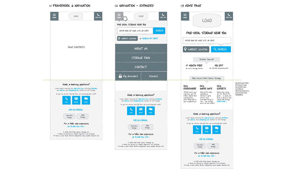
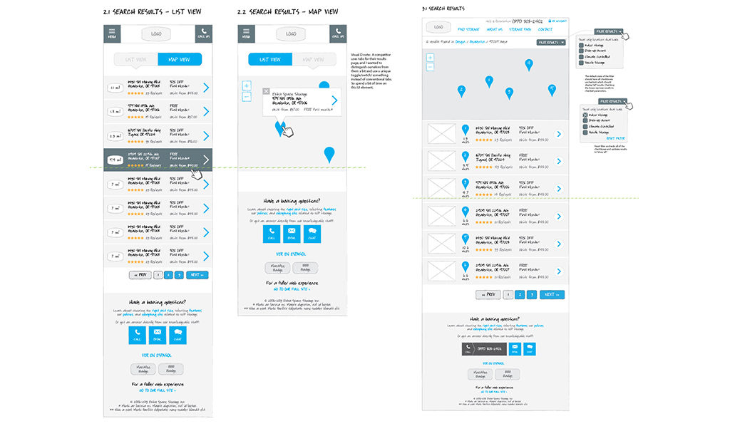
The essence of an effective mobile experience boiled down to simplifying the decision-making process for the user, which was all about showing the right amount of relevant information needed to make a decision at each step of the way. This approach significantly de-cluttered the site, reducing friction and improving the conversion funnel.
Role: UX Lead
Deliverables & Activities: Expert review, competitive analysis, stakeholder interviews, personas, wireframes

