Mobile App
Ballistic Solver App
Summary
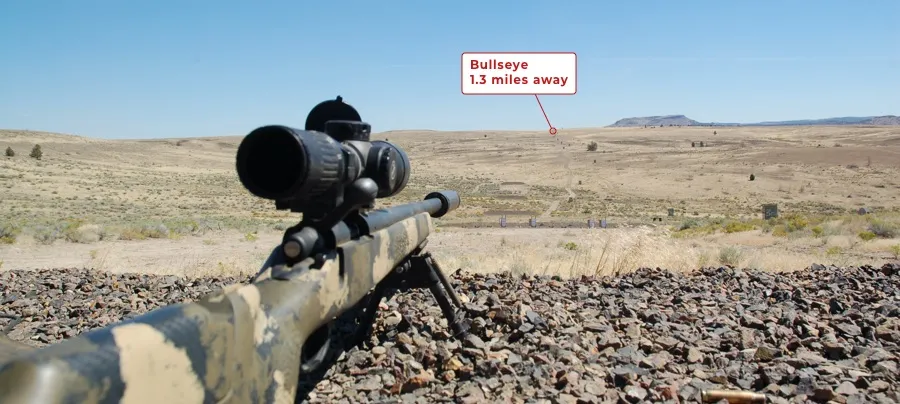
Aerodynamics, gravity, spin drift … hitting a bulls-eye a mile away is as much art as it is science. The science boils down to entering the right data into a ballistic calculator, while the art is the intuition of the shooter that only comes with years of experience. How do you design a ballistic solver app that makes trajectory predictions a breeze for novices, while giving elite long range shooters a new tool of choice? This was the challenge of this project.
Project: Ballistic Solver App
Client: Undisclosed
Platform: iOS, Android
Role: UX Lead, Art Director
Activities:
- Discovery workshops
- Contextual inquiry
- Personas
- Flows
- Prototyping
- Interaction design
- Design direction
Process:
- Goals & Scope
- Immersion & Research
- Personas & Flows
- Prototypes
- Visual Design
Contextual inquiry
Flows
1. Goals & Scope
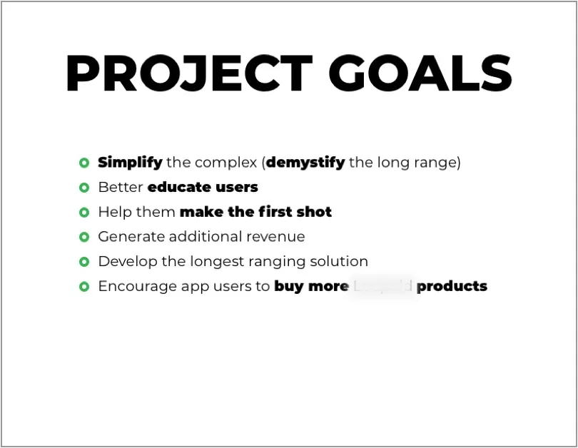
Our client is a leading manufacturer of rifle scopes and range-finding devices. They were developing a new smart binocular that could not only detect range but also offer trajectory predictions (aka RTBS – real time ballistic solver). In order for the RTBS part of work, a smart phone was needed to ask for additional user input, auto-detect variables (eg. altitude), and do ballistic calculations to feed back to the binocular via Bluetooth.
Additionally, the client wanted a standalone ballistic solver app that leveraged our powerful RTBS algorithm. The standalone app would in turn help to promote the smart binocular.
So the task was to design an app that fulfilled two primary roles:
- A standalone ballistic solver with free and paid version
- A free companion app for the client’s new Bluetooth binocular
2. Immersion & Research
Diving into the unfamiliar
The technical complexity of this project required us to become mini-experts on the subject of external ballistics in a short amount of time. This was hard because no one on my team had any long range shooting experience (or any shooting for that matter). It was a strange world, full of brainy science, acronyms, and a certain kind of demographic.
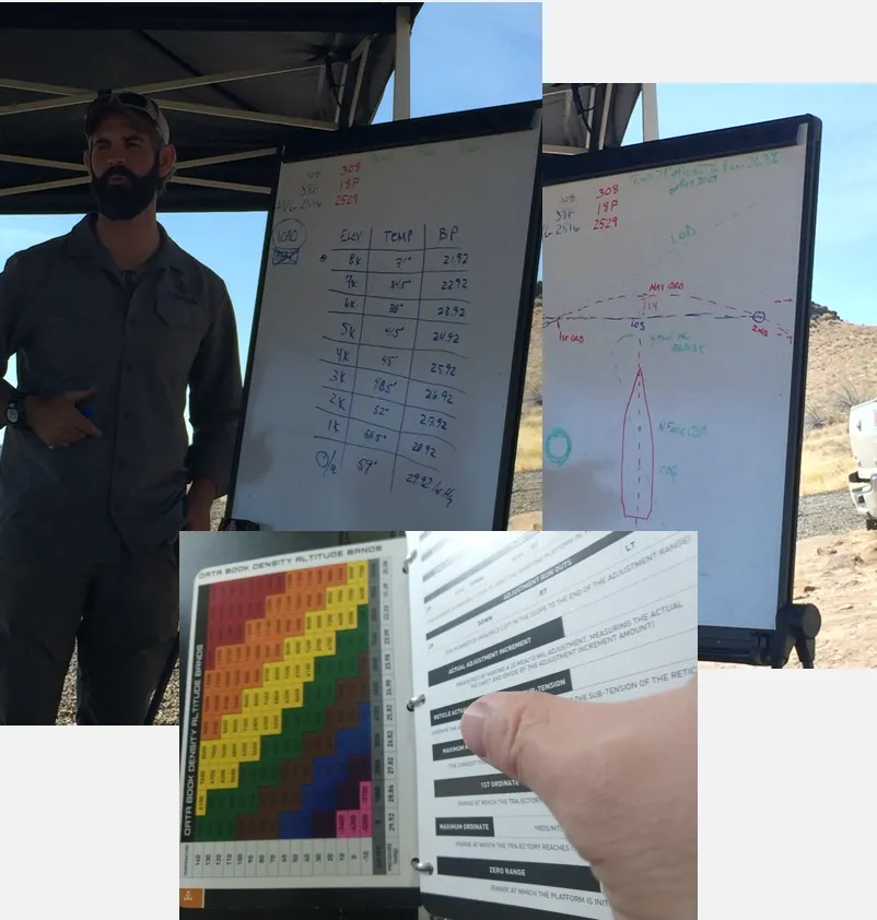
We took classes, watched YouTube videos, studied manual tools (like altitude density bands) and had many Q&A sessions with long-time shooters and even a resident mathematician on the client’s team.
An effective way to understand a user is to share in their journey. We’ve traveled to a shooting range for a two day immersive workshop where had a chance to interact with fellow shooters as they learned the techniques and tried out different tools.
This experience helped us immensely to understand:
- Different user archetypes
- Their tools
- The process that they go through in a typical long range outing
- The points of frustration
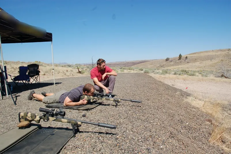
We also got the taste for what they enjoyed most about the sport.
💡 User Insight
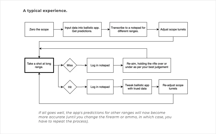
The first shot was always a miss, no matter which ballistic solver used.
There seemed to be a mystery element to every location that threw a wrench into ballistic formulas, even if the data entry was perfect. To compensate, users had to “true” the predicted hold values based several trial-and-error shots.
Interestingly, it was a common practice to reverse engineer the apps’s algorithm, fudging certain variables (usually the ballistic coefficient) to get apps predications in line with the actual trued numbers.
This is where many users became frustrated, as they kept missing using the predictions from their apps, often switching between different apps.
Take away #1: We wanted to tackle this mystery element and give users a powerful set of truing features. (Later on, the truing module became our main competitive advantage).
Take away #2: Users tend to blame the app for their misses, even if the fault was their lack of experience. We wanted to provide a robust education layer to encourage learning.
💡 User Insight
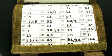
Users utilized pen & paper quite a bit.
Even if a digital option was available, most preferred a notepad and a pen for keeping a log of their misses and hits. They complained that there was no easy way to log in apps, and they worried about running out of battery power during cold weather.
On the second day, many shooters brought printed cards with their own “dope” charts: small-font excel print outs that you could keep in the pocket.
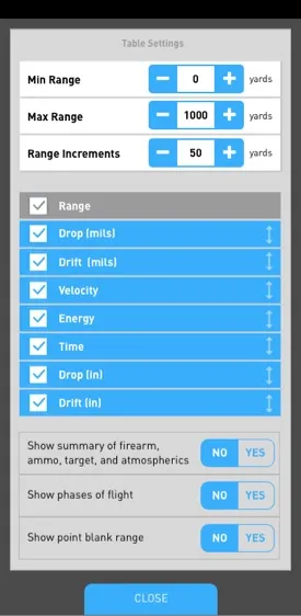
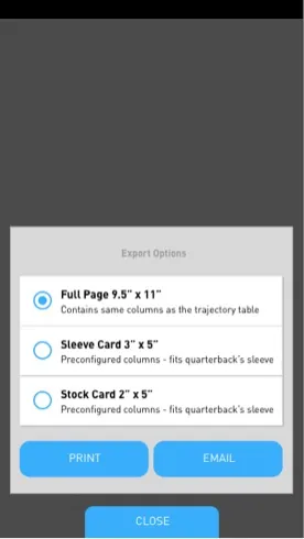
Take away: We wanted the app to be exceptional at logging and able to generate printable dope charts.
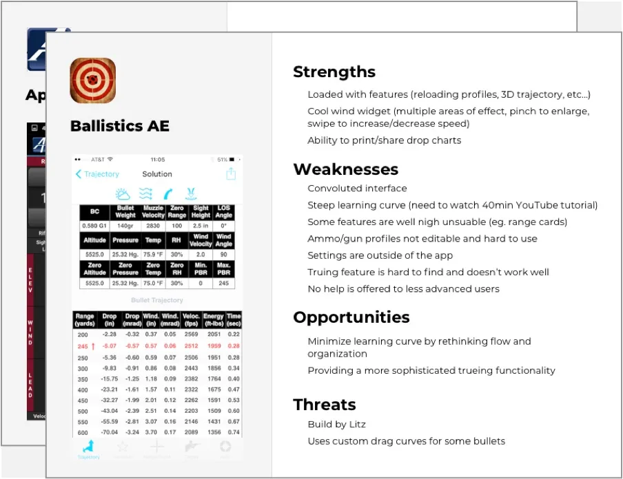
Learning from the competition
During the shooting range trip, we took note of various apps that user had on their phones, and analyzed top four based on their strengths, weaknesses, opportunities, and potential threats.
App store reviews offered great and easy insights into common problems as well as things that everyone likes.
For example, users often complained about apps nickel-and-diming for every “advanced” feature (eg. $10 for custom drag models, $5 to see graphs, etc…). We wanted to try a business model that didn’t do this.
3. Personas & Flows
Personas and user landscape
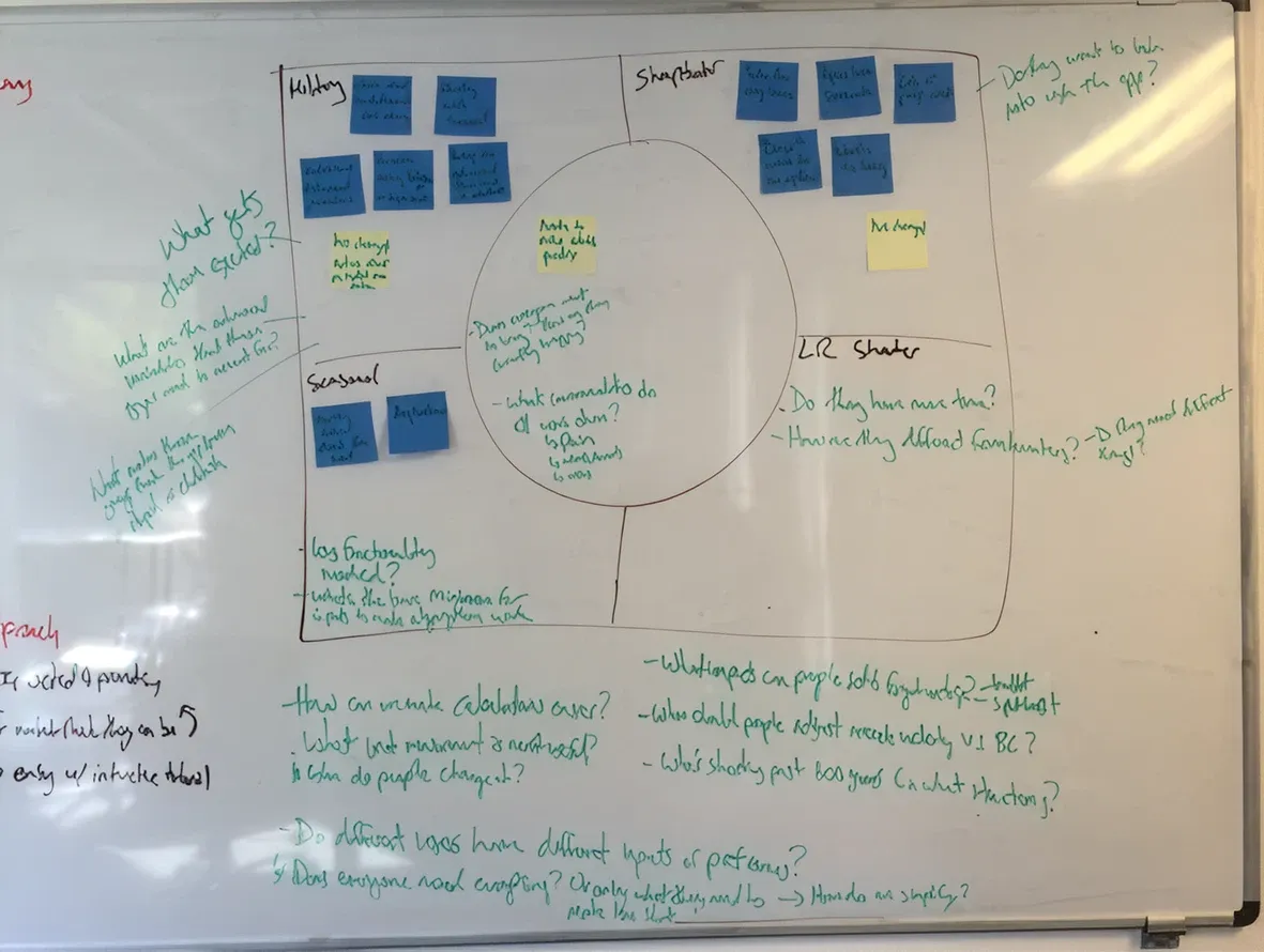
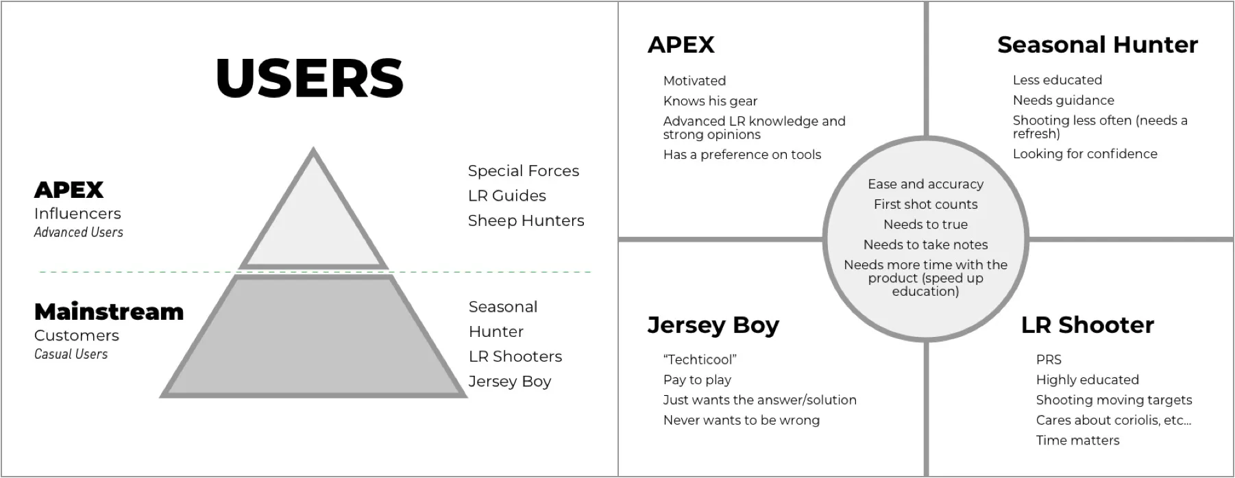
We held a personas workshop to figure out how can our app better fit within the landscape of two primary categories of users: the APEX (influences) and the mainstream (customer).
Interestingly, although APEX users were a minority, they were the early-adaptors and thought leaders in the community, playing a key role in the dissemination of new tools.
An APEX user wouldn’t be interested in our app unless it had advanced features (like spin drift or showing trajectory curves). On the other hand, the mainstream user could be daunted by the app if its too technical.
Take away: We had to get the APEX users on board. To do that, the app had to provide advanced features to the elite users, while being approachable by the mainstream.
At this point, the scope and the functionality pieces were starting to come together. We knew enough of the ballistic science, our users, the competitors, and we’ve identified the opportunities that would make our app indispensable.
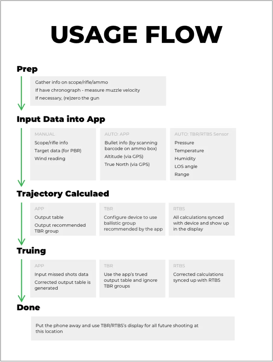
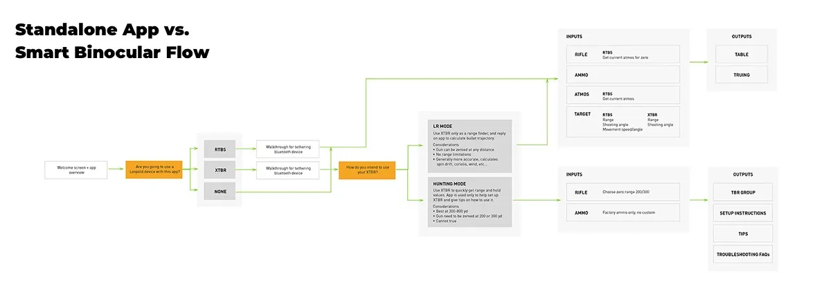
We’ve put together several flows to plan out how all of the pieces went together. Now it was time to start designing.
4. Prototyping
Design sprints
We were fortunate enough to have easy access to our users, so we’ve incorporated external reviews into the design spirts.
We followed lean methodology, designing medium fidelity prototypes to get the most of out of review sessions and integrating frequently.
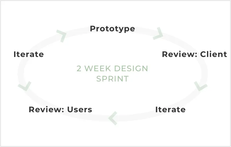
Framework
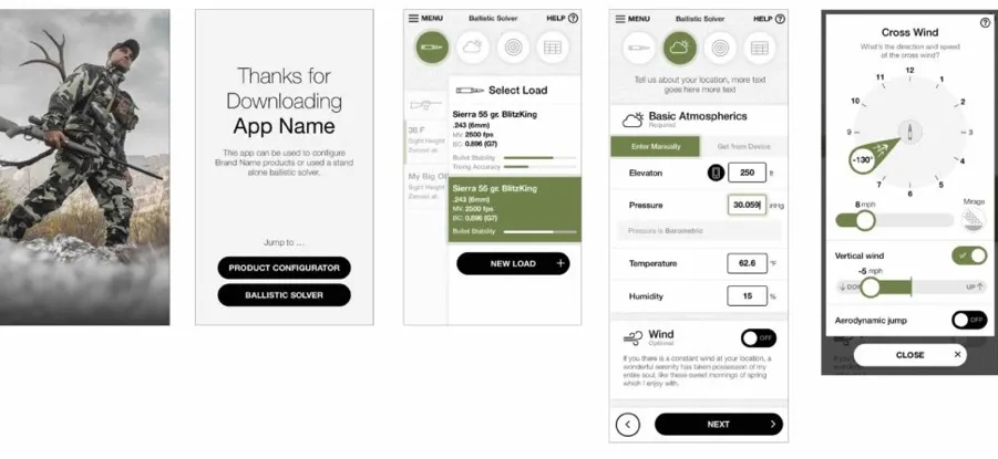
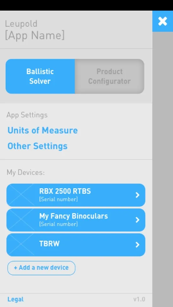
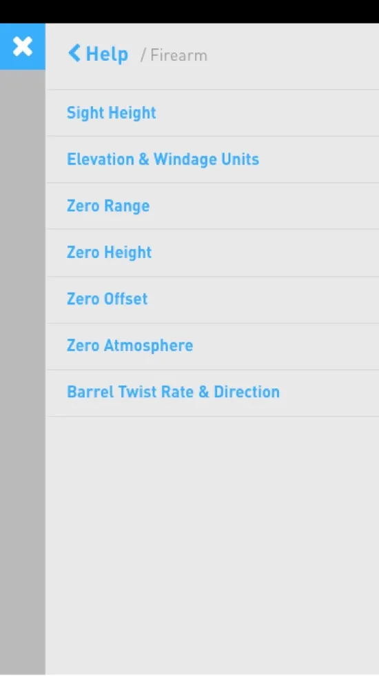
Sample screens:

💡 User Insight
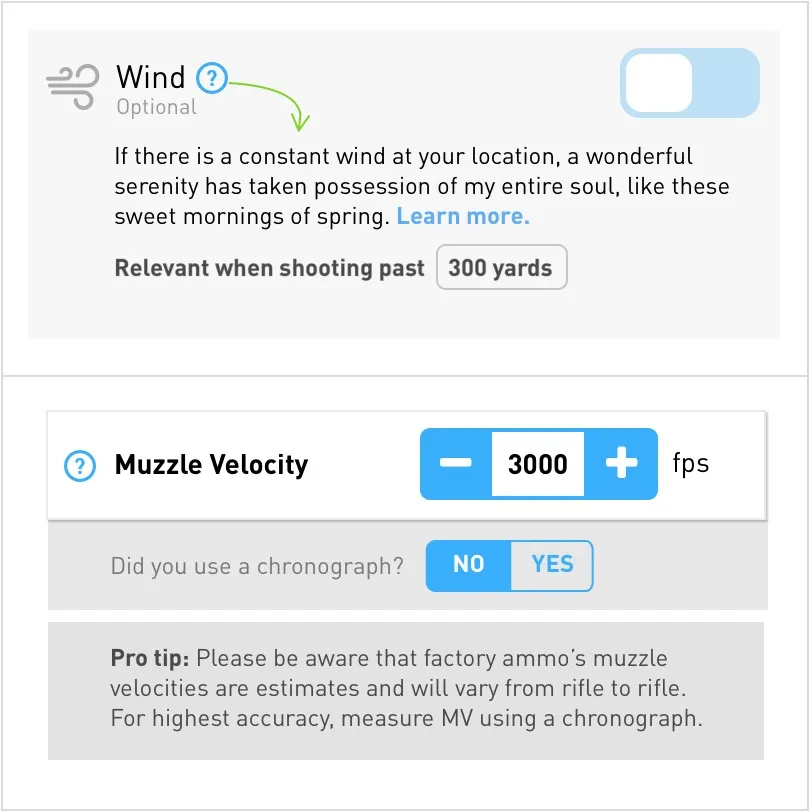
Too proud for “basic mode”
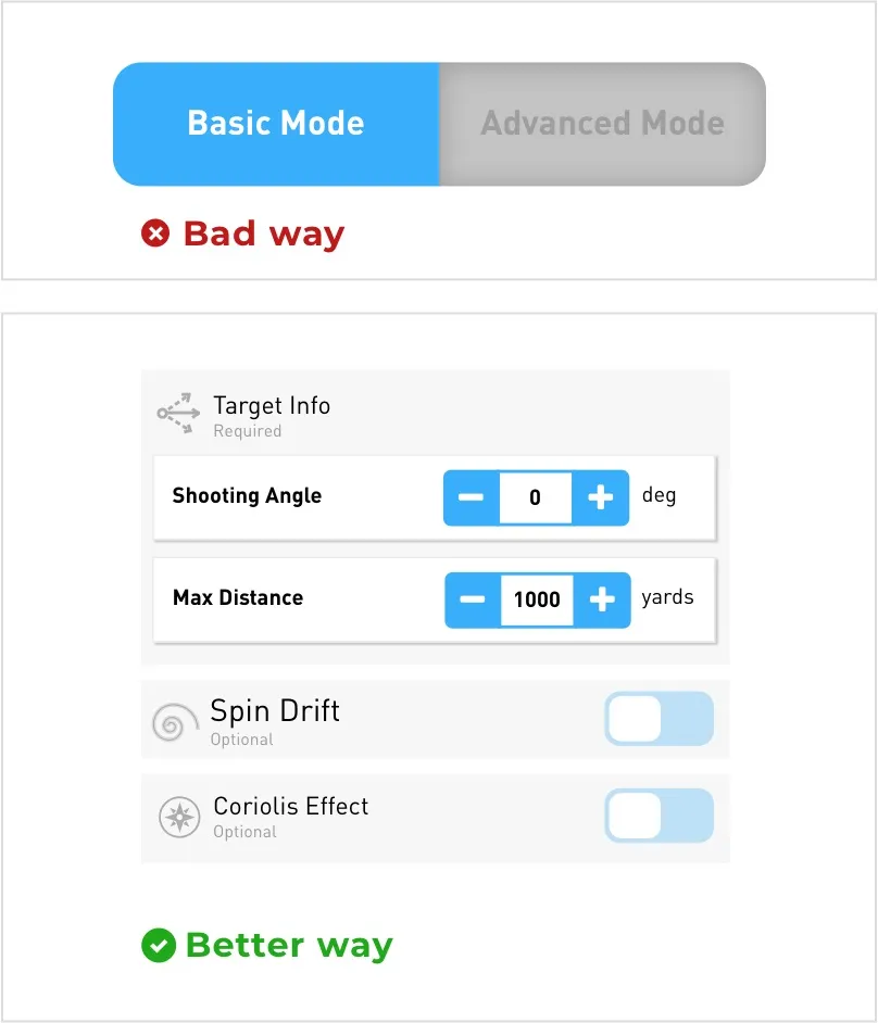
To serve more advanced features to elite users, our first idea was to have advanced mode toggle on the onboarding screen.
After showing several versions to users, we noticed that pretty much everyone (regardless of their skill level) toggled on the advanced mode. Many thought themselves more experienced than they really were. Although this is a normal human tendency, it seemed to be stronger in this demographic.
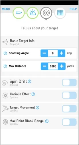
Fix: Instead of labeling things as basic or advanced (and triggering advanced features via a toggle), we labeled them as required vs. optional. This had an added benefit of introducing a casual user to the next level of considerations for increased accuracy at longer ranges.
💡 User Insight
Contextual education works
The ability to access educational layer as you’re entering data has proven to be affective for making novice shooters feel more confident about trying out advanced features.
Uses seemed to really appreciate the “Relevant when…” sign posts and “Pro tips.”
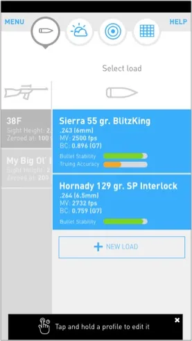
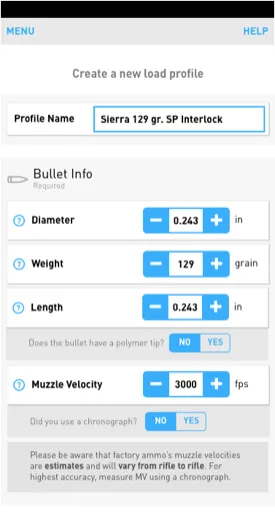
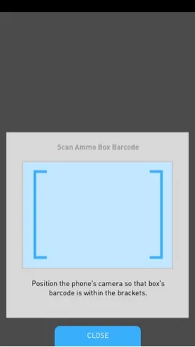
Firearm & Load
Sample screens:
Atmospherics
Sample screens:
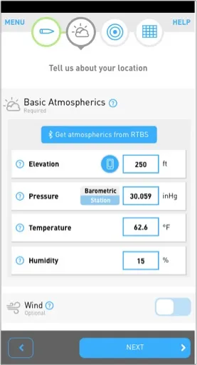
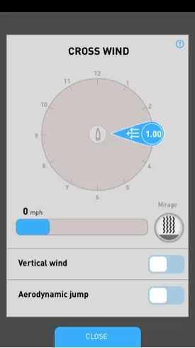
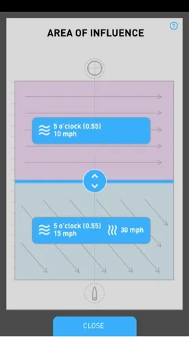
💡 Usability Insight
A curious case of mirage
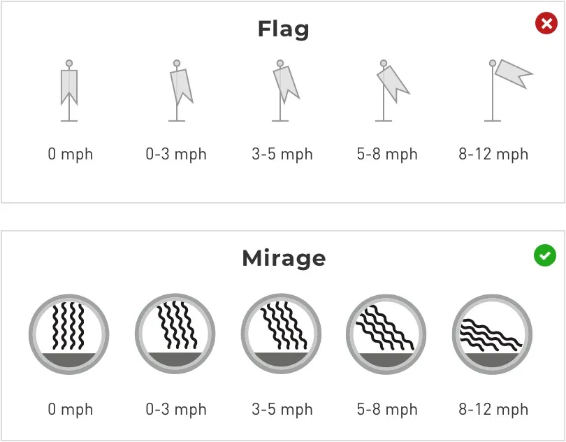
Accurately reading wind is challenging to say the least, especially if you don’t have the right tool. The most basic tool, and what we’ve started with, is a flag (or any piece of fabric). You can tell wind speed by looking at the angle that a fabric is flapping at. Problem was, the wind could be blowing harder near the target than near the flag, and gusts made it almost impossible to get a consistent reading.
A long range veteran gave us a solution. Turns out that a mirage, which is shimmering layers of air you see in the distance, can be used to accurately read wind (right by the target). And the learning curve turned out to be surprisingly low. Even I was able to read the direction of the shimmer after few minutes of starring through the scope. Pretty cool.
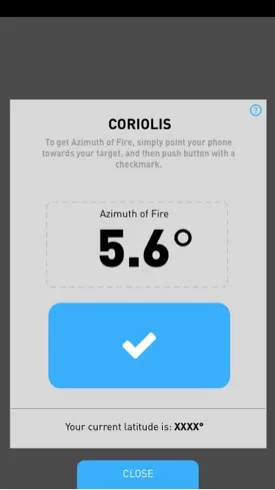
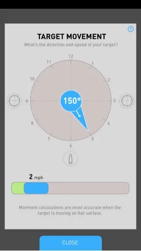
Target
Sample screens:
Trajectory
Sample screens:
💡 Usability Insight
Phases of flight
On the shooting range, we saw that apps got most of the blame for users’ misses, where a little bit of ballistic knowledge could have prevented this. One of such examples is phases of flight.
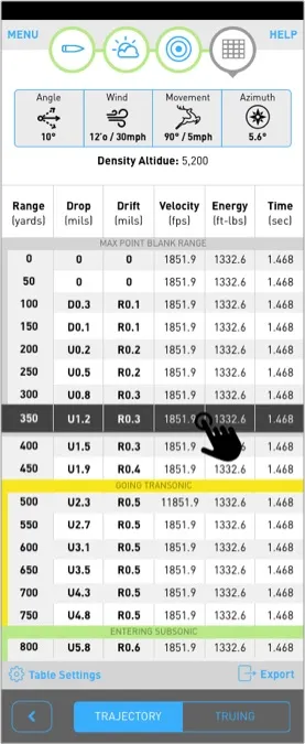
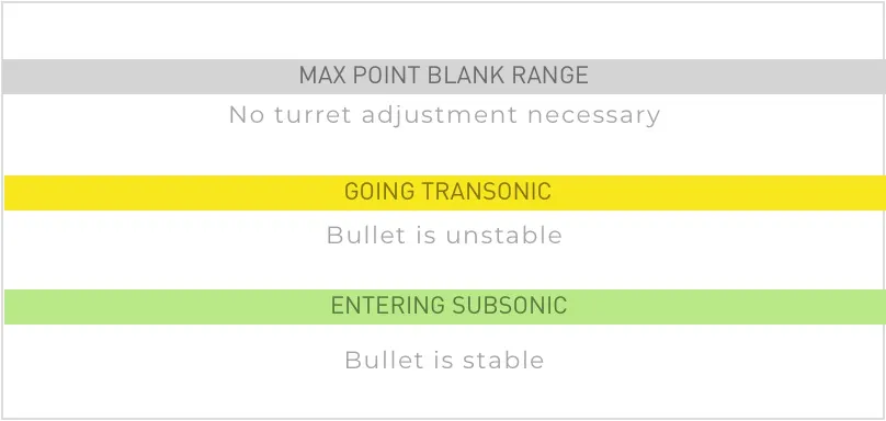
There is a mid-section of the bullet flight – transonic – (before it reaches the stable subsonic velocity) that temporarily compromises bullet stability. Any ballistic predictions in the transonic region tends to be unreliable.
Therefore, we’ve indicated the transonic rows in the dope chart, and yellowed them out as a warning.
💡 Usability Insight
Shortcuts are useful
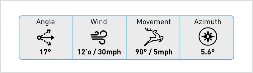
Some environmental variables were more or less stable (eg. elevation, temperature, etc…), while others needed more frequent tweaking (eg. wind, shooting angle). We’ve added shortcuts to the trajectory screen to make those tweaks on the fly.
💡 User Insight
In app purchases
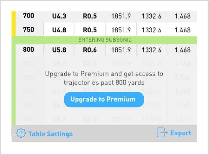
We found that it was better received by the users when instead of restricting features, we’ve limited the free version of the app to not show predictions beyond a certain range.
Truing
Sample screens:
💡 Feature Insight
Smarter algorithm every day
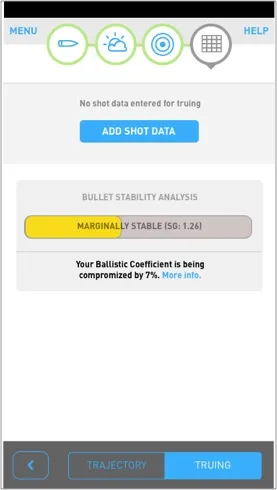
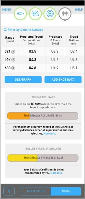
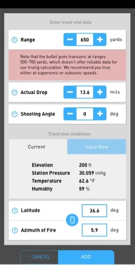
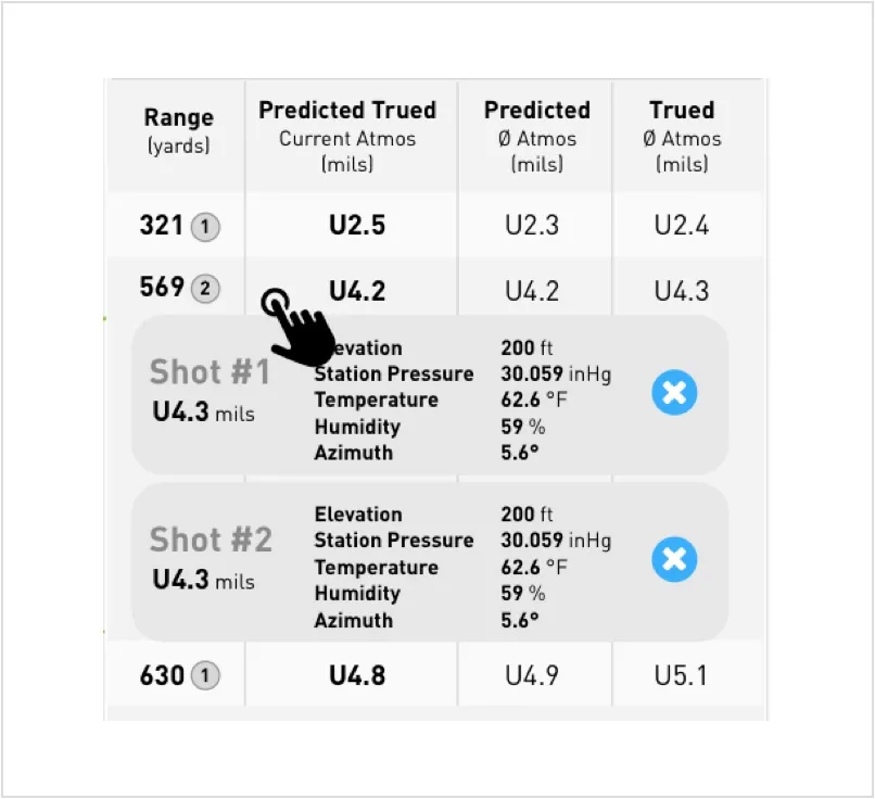
Truing module took on a life of its own when we realized that adding trued shot data across different firearms/loads and atmospheric conditions would allow a shooter to solve for the mystery factor in new locations. When our resident mathematician said that it was possible, we knew that we stumbled across something big.
Phase 2 possibilities started to emerge: can we use the vast trued shots repository to actually teach our algorithm to be smarter as more people use the app? Can our app eventually adjust for the mystery factor? Privacy was a potential issue. But the possibility was exciting nonetheless.
💡 Feature Insight
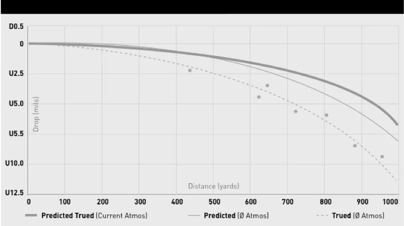
Picture’s worth a 1000 words
We wanted to encourage users to use the truing feature more, so we’ve added a graph feature to show how their shots are training the algorithm. The more shots you have, the smarter the trued predictions.
5. Visual Design
I’ve worked with a designer to establish the design direction and the visual language for the for the app.